User Guide
Point of Sale Screen
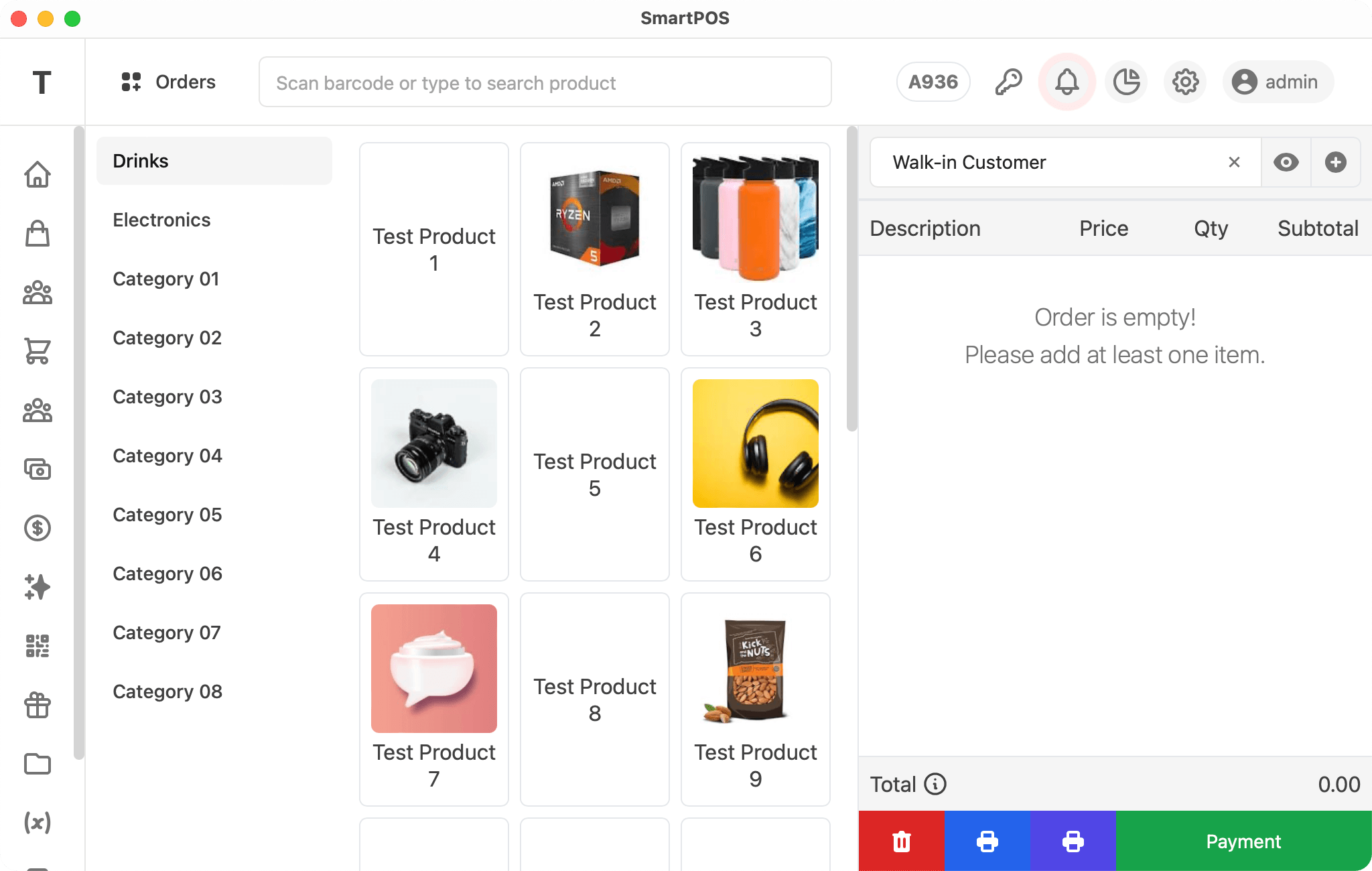
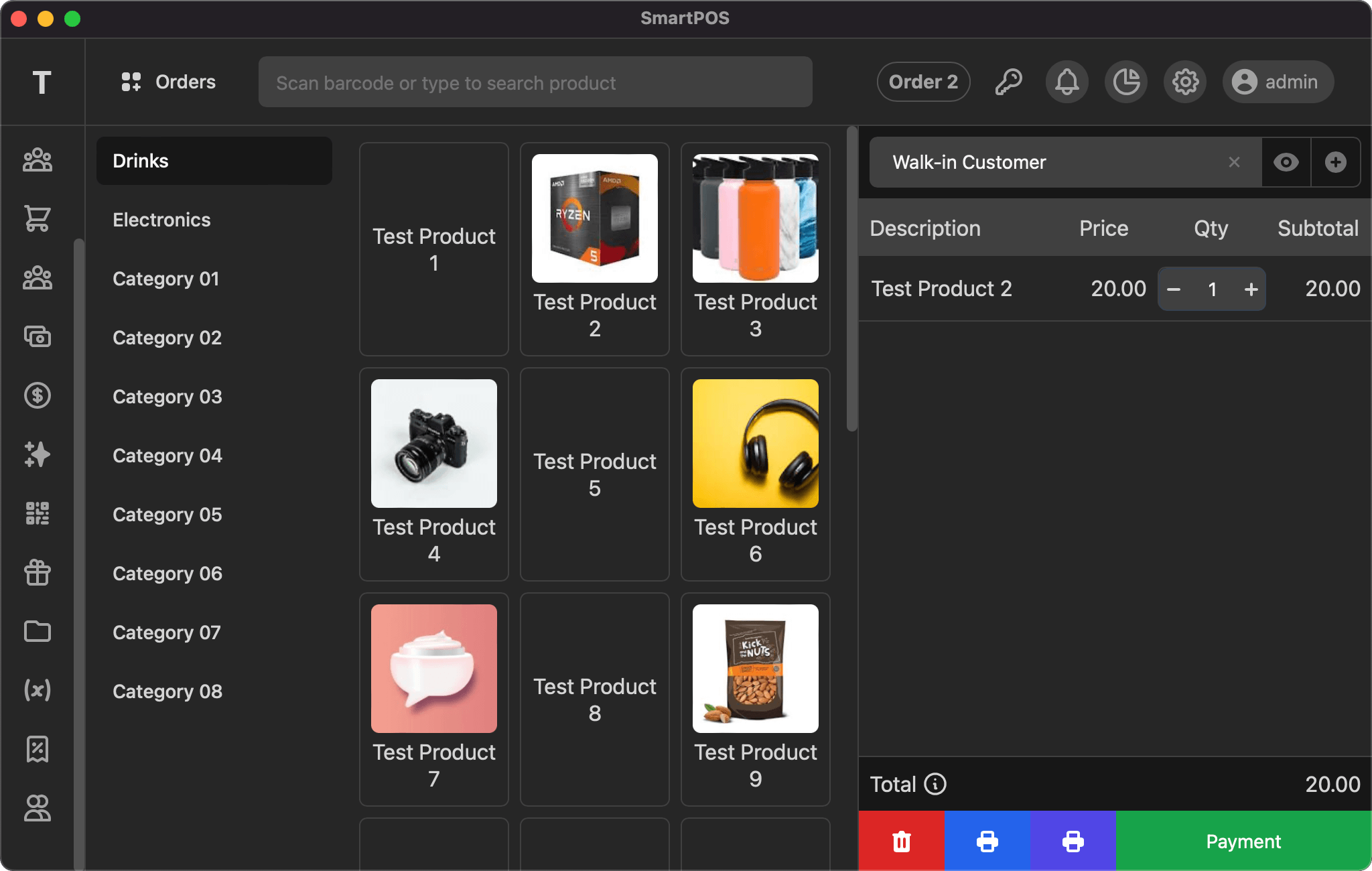
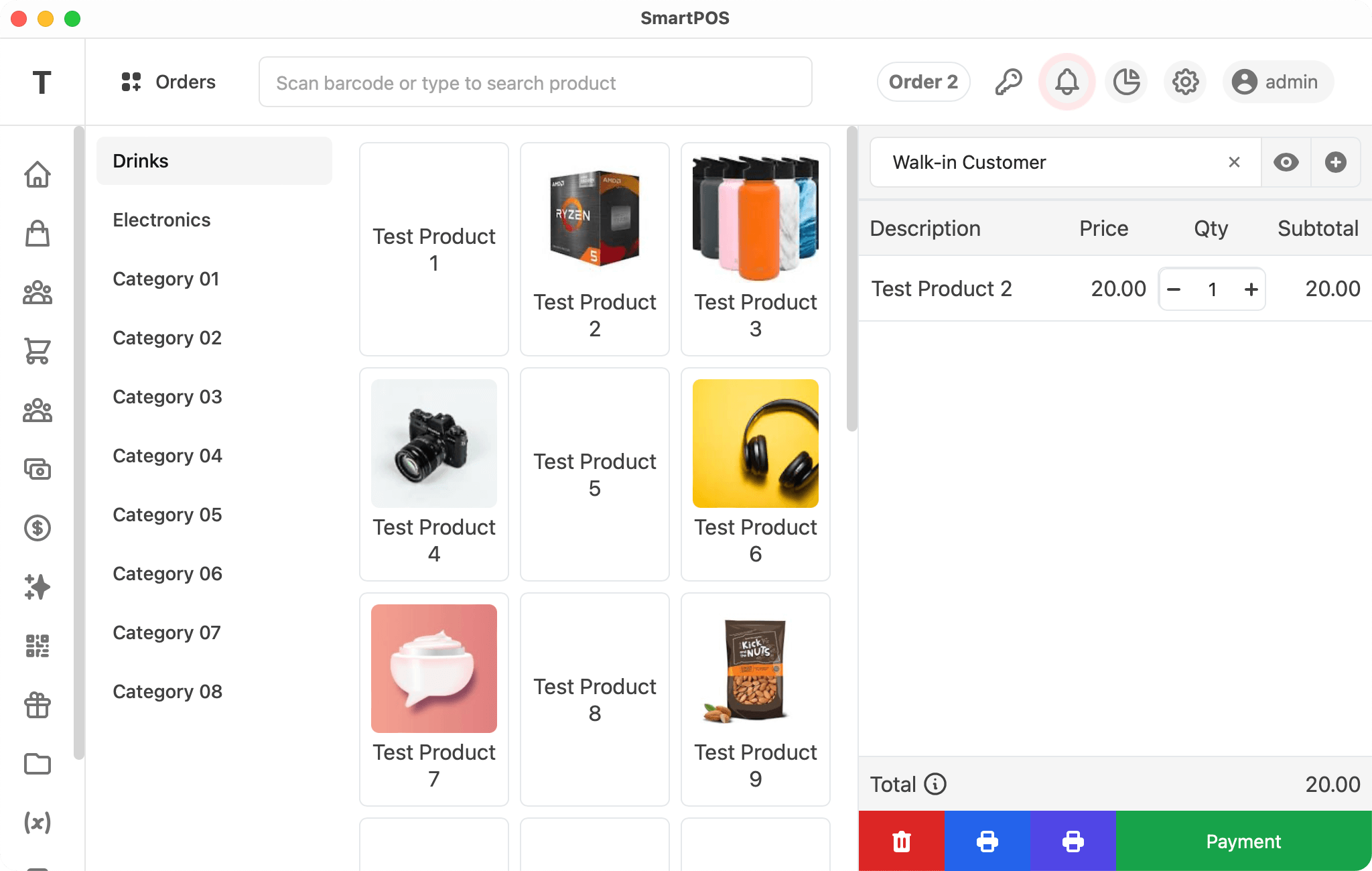
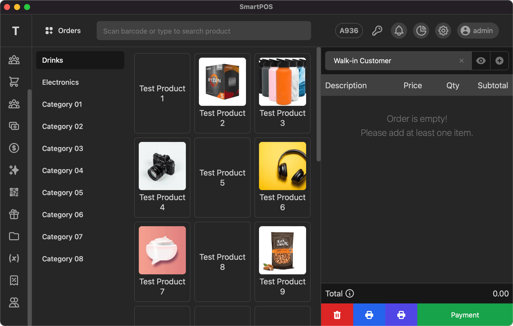
SmartPOS has simple user interface that is easy to learn, minimize the time for training.


Top bar
Point of Sale screen display the first character of your company name as logo then orders with option to open new, search bar to search products to add them to order, current selected order them menus for alerts, reports, settings and user.
Left side bar
Point of Sale screen has collapsed version of left side bar that only display menu icons and the first character of your company name.
Grid area
The grid contents area hsa 2 parts i) categories list and ii) products grid for the selected category.
i) Categories list
This area show all the categories and is vertically scroll-able if the categories are more than display height. You can click any category name to load the products for that category.
ii) Products grid
Products gird will be display as per your settings i) Name, ii) Photo or iii) Both. This area is also vertically scroll-able if the products are more than display height. You can click any product to add it to the selected order.
Order area
The order area hsa 3 parts i) customer selected, view and add option at top, ii) order items listing in the middle and iii) order total with action buttons at the bottom.
i) Customer
You can search and select the customer to associate the sale. Once customer selected, you click the view icon to view details. If you want to add new customer, then click the plus icon and fill the form shown in modal.
ii) Order items
The items added to the order will be listed here with product name (click to change price and/or apply discount), price, quantity (as input) and row total. This section is vertically scroll-able.
iii) Total & Actions
The order total is displayed at the bottom with option to view the total tax. The last row has the actions button to delete the order, print the order & bill and payment to finalize the order.


If you have any suggestions, please start a discussion.